


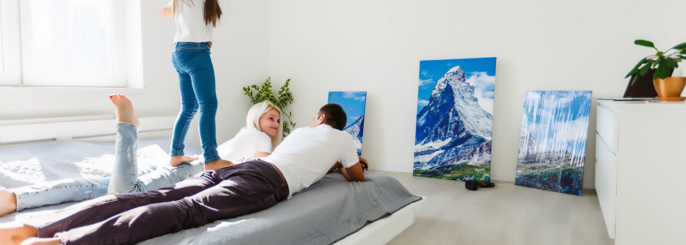
Have you ever walked into a home that simply took your breath away? The secret often lies in thoughtful home art staging. It’s essential if you want your property to stand out, whether you’re selling or just refreshing your space.
Join us as we dive into practical tips for showcasing art beautifully, ensuring your home makes a lasting impression.
Tips For Home Art Staging
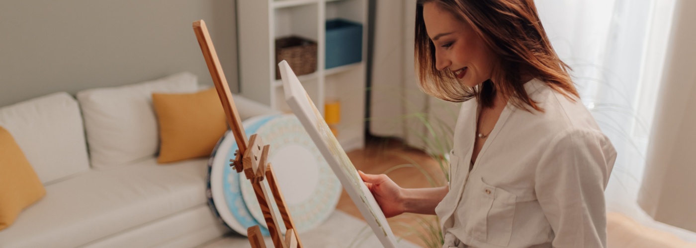
Staging art properly requires a balance between style and restraint. Art should complement the room’s layout, furniture, and color palette instead of competing with them. When done well, artwork becomes part of the architecture of the space, guiding the eye and reinforcing a sense of order.

Poorly staged art, on the other hand, can distract from beautiful design elements and make rooms feel smaller or busier than they really are. Successful home staging focuses on consistency, alignment, and simplicity to create visual harmony throughout the home.
These principles apply whether you are preparing a home for sale, refreshing a rental property, or updating your own living space. By following a few clear guidelines, you can use art to enhance every room without overwhelming it.
Keep Frames in a Consistent Finish
Frames are often overlooked, but they have a major impact on how art is perceived. When a wall includes frames in many different finishes, sizes, and styles, the result can feel messy even if the artwork itself is beautiful.
Consistent frame finishes help create a sense of order and make the artwork feel intentional rather than random.
Choose a frame finish that matches the tone of the home, such as black for modern spaces, natural wood for warm interiors, or white for clean and minimal designs. You can vary the size of the artwork while keeping the frame finish consistent to add interest without chaos. When frames work together visually, the artwork feels curated, and the room instantly looks more polished.
This approach is especially important in gallery walls or hallways where multiple pieces are displayed close together. Consistent frames allow the viewer to focus on the art itself instead of being distracted by competing borders. Even simple artwork can look high-end when the framing is cohesive.
Align Art With Door and Window Lines
Artwork should feel connected to the structure of the room, not floating awkwardly on the wall. Aligning art with doors, windows, and trim lines helps create balance and makes the room feel thoughtfully designed. When art placement ignores architectural features, it can make walls feel uneven or visually uncomfortable.
A helpful method is to use the top or center lines of doors and windows as visual guides when hanging art. This creates an invisible structure that keeps everything looking aligned. Art that follows architectural lines makes a space feel calmer, more organized, and visually appealing.
This technique is particularly useful in entryways, staircases, and long corridors where alignment helps maintain flow. Even in open spaces, aligning art with nearby architectural features helps anchor the room and prevent artwork from feeling misplaced.
Repeat One Accent Color Throughout
Repeating a single accent color through artwork is a subtle but powerful staging technique. This color does not need to dominate the artwork, but it should appear consistently across different rooms. Repetition creates a sense of continuity that makes the home feel unified instead of segmented.
Choose an accent color that already exists in the space, such as a tone found in throw pillows, rugs, or decorative objects. Artwork that includes this color naturally ties into the rest of the décor. When art quietly reinforces an existing color palette, the entire home feels more connected and intentional.
This approach works especially well in open-concept homes where multiple areas are visible at once. Repeating a color through art helps guide the eye smoothly from one space to another, creating a sense of flow without making rooms feel repetitive or overly styled.
Leave Breathing Room on Every Wall
One of the most common art staging mistakes is overcrowding walls. While it may be tempting to fill every empty space, too much art can make a room feel smaller and more chaotic. Empty space is an important design element that allows artwork to stand out and gives the eye time to rest.
Focus on placing art in key areas where it will have the most impact, such as above sofas, beds, or consoles. Leave surrounding walls simple and uncluttered. Breathing room around artwork creates a sense of balance and makes the space feel larger and more refined.
Spacing also affects how valuable the artwork appears. Art that is crowded by other pieces or furniture can feel less important, while art with space around it feels intentional and elevated. Strategic restraint often results in a more elegant and inviting environment.
Use Soft Non-Glare Lighting
Lighting is essential to how artwork is experienced in a space. Poor lighting can flatten colors, create harsh shadows, or cause glare that distracts from the art. Soft, even lighting allows artwork to be appreciated without overpowering the room.
Use warm-toned lighting that gently highlights art rather than shining directly onto it. Adjustable lamps or indirect lighting work well for this purpose. Soft non-glare lighting helps artwork enhance the mood of a room instead of competing with it.
Avoid placing art directly opposite strong light sources like uncovered windows, as this can cause reflections and reduce visibility.
Thoughtful lighting not only improves the appearance of artwork but also adds depth and warmth to the entire space, making rooms feel comfortable and well-balanced.